Patterns reflect behavior, help prepare us for market developments
 Price activity is the result of human behavior. People do not randomly buy or sell in the market. The decision to buy or sell may be carefully considered, it may be a poor decision, or it may be an action later regretted. In all cases the decision contains an element of emotion and this emotional behavior is reflected in the movement of prices.
The result, in some cases, is the development of a range of patterns of price behavior. These are chart patterns and they define the ebb and flow of human emotion as effectively as a cardiogram beside a hospital bed.
For convenience we give them descriptive names. There are patterns of enthusiasm such as rising trends and bullish flags. There are patterns of depression, such as down sloping triangles. The chart pattern that is of most interest at the moment in the equilateral triangle and the consequences of the Shanghai index breakout below this pattern over the past two weeks.
The equilateral triangle shows market indecision. Those who are bullish are almost evenly counterbalanced by those who are bearish. The market waits on news, and the measures taken to cool the property market are the news that has tipped the balance in this market pattern.
Chart patterns reflect human behavior and they help prepare us for market developments. They point the way to high probability outcomes, including potential price targets. The pattern in the Shanghai index now suggests a very much lower target because this is the normal behavioral outcome of this chart pattern.
The Shanghai market's plunge below 3000 on April 19 carried the index below the lower edge of the long term equilateral triangle. For a few days the index hovered near this level giving traders time to exit. Last week the market developed the expected behavior with an accelerating fall below 2900. This creates a very bearish situation.
There are three factors to consider.
1. The behavior of breakout strength in triangle chart patterns
2. The lower level support target areas
3. The behavior of leading trend reversal indicators, such as the Relative Strength Indicator (RSI)
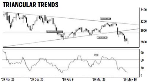
Triangle chart patterns are created by the combination of trend lines and support or resistance levels. The duration of the triangle is divided into thirds. The most powerful breakouts from the triangle pattern come from the middle third of the triangle pattern. These powerful breakouts have a high probability of achieving and exceeding the triangle target projection level.
A breakout from the final third of the triangle is often weaker and there is a lower probability of the breakout reaching the pattern target projection levels. The current breakout has developed in the final third section of the triangle from March 2010 to June 2010.
This weaker breakout increases the influence of the nearby support areas. The technical downside target for the triangle pattern is near 2200. This is calculated by measuring the height of the base of the triangle. This value is projected downwards from the point where the breakout developed.
The technical downside target near 2200 is a low probability target because of the strength of the support levels at 2900, 2700 and 2400. A falling market has to move through each of these support levels before reaching the final target. These support levels slow the speed of the fall.
Traders and investors are watching the market retreat and they are waiting evidence of a rebound and the development of a new uptrend. The evidence of a rebound starts as the Shanghai index moves toward the support areas. The evidence is also found in the behavior of the RSI. The key behavior is the development of an RSI divergence.
An RSI divergence signal develops when the trend line applied to the RSI moves in the opposite direction to the trend line applied to the price chart. Activity in the area below 30 percent on the RSI indicator is important.
There are two potential divergence patterns. The lows in the Shanghai Index already have a downward trend. The RSI divergence can develop as a double bottom rebound in the RSI.
In this situation the RSI trend between the valley lows is horizontal. The strongest RSI divergence develops when the RSI trend line slopes upwards and moves in the opposite direction to the trend line on the index chart. Traders watch for this situation to develop and use this as a leading indicator of a market rebound and reversal.
The author is a well-known financial technical analyst