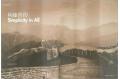
 'Commune
by the Great Wall' is not a leftover of Cultural Revolution social engineering.
Nor is it a cult gathering to mark the winter solstice. And according to its
masterminds, developer couple Zhang Xin and Pan Shiyi, it isn't an even faintly
ironic nomenclature, although it describes a development of high-priced, privately-owned
residences most definitely not built to be shared by the rural masses. After
all, those uniformed security personnel at the gates aren't there to keep out
capitalists, and there's not a decent proletariat in sight. The only 'running
dogs' you'll see at Commune will likely be of the furry-and pampered-variety.
'Commune
by the Great Wall' is not a leftover of Cultural Revolution social engineering.
Nor is it a cult gathering to mark the winter solstice. And according to its
masterminds, developer couple Zhang Xin and Pan Shiyi, it isn't an even faintly
ironic nomenclature, although it describes a development of high-priced, privately-owned
residences most definitely not built to be shared by the rural masses. After
all, those uniformed security personnel at the gates aren't there to keep out
capitalists, and there's not a decent proletariat in sight. The only 'running
dogs' you'll see at Commune will likely be of the furry-and pampered-variety.What Commune is, is a searingly clever development of designer villas in a dramatic setting just outside the decade's hottest capital. Expertly marketed by its hyper-savvy developer, Redstone lndustrie Co Ltd, this gated, landscaped, club-housed enclave is quite unlike anything in China or just about anywhere for that matter. Close precedents don't really exist. Architectural exhibitions do, but rarely are they mounted with commercial goals, and not at the heart of the planet's dominant socialist nation. Hence looking for comparative models is slightly bedside the point. Commune really has to be judged on its own merits, which is no doubt exactly as its owners intended.
The idea was at once intriguing and preposterous. Perhaps this is what made it irresistible first to its authors, then to its collaborators. It would be a shotgun marriage of hot-off-the-press trending and cultural altruism, with razor-sharp commercial instinct as maid of honour. If originality is one of the keys to marketing - and generally anathema to developers - this project set out to shift the compass points.
Redstone is not exactly your average developer. Even before Commune by the
Great Wall, the company had distinguished itself with a Beijing development
called SOHO New Town, in the heart of the huge city. A cluster of colour-coded
towers share a city block, offering loft-like spaces aimed at small, new-economy
clients. Redstone is trying to introduce to modern, young, urban Chinese flexible
spaces that can be used for living, working, playing, or all three together.
The success of these non-traditional offerings has fuelled the company's expansion,
proof of an audience ready for spaces a little different from the norm. The
units themselves would not seem unfamiliar in cities like New York or London
perhaps, but that in itself makes them stand out in Asia. And often ingenious
marketing strategies haven't hurt the company's image-building. Simply put,
Redstone is hip. And as salesmen the world over know only too well, hip equals
gold.
For Commune by The Great Wall, something yet more ambitious was attempted. A
development that would, in a sense, build the opposite of flexible, raw loft-space.
"Designer" houses are specific, idiosyncratic, challenging. They are
generally inflexible signature works recognised more for their poetry than their
pragmatism. They are notoriously hard to sell and resell, other than to aficionados,
who are attracted to the notoriety factor. They require high maintenance and
resist alteration and renovation. They are, in other words, trouble Private
residences by Frank Lloyd Wright, Le Corbusier. Even Andrea Palladio, have spent
decades neglected and derelict because their owners simply couldn't cope with
them. They become decaying pilgrimage sites for intrepid architecture students.
Or charity cases for architectural societies. At least until some new owner
comes along to pour love, devotion and fortunes into restorations. Trailed by
groovy style magazines that 'rediscover' them as fetish-objects of the month.
And, while the 12 architects of the Commune development are not quite Le Corbusier
or Palladio (at least not yet), Redstone is betting that the difficulties of
commissioned designer/architect houses can be overcome. Or at least, that the
recognition quotient is worth the trouble. Zhang Xin and Pan Shiyi are not the
types to fear controversy or to shy away from the unknown. They also enjoy architecture.
One senses that even apart from the commercial realities of the whole enterprise
- which are clearly important - Redstone might have gone ahead with this project
for the sheer fun of it. Commission a dozen young talents and let them be brilliant.
Give them each a dramatic site. Decent budget and schedule. Next to no programme
or requirements. And see what they come up with. Then market the hell out of
it.
What they did come up with is 12 of the most contrasting works of small architecture
to be seen on this side of the planet. Snaking up a narrow gully just below
a section of the Badaling Great Wall, the houses cling like exotic zoo creatures
to the green hillsides either side of the drive. Quickly evident is the lack
of dimension constraints, as the houses for the most part seem large and their
proximity to each other exaggerates this quality. In the West, many of these
would be described as 'mansions'. What is also on show is that they are on show.
There are none of the usual concealing garden walls of hedges, or even garages
shoved forward to shield the private bits (or hide the Benz's). The houses are
blatantly visible from the, albeit private, road. Once inside Commune, inhabitants
(and their guests) actually do share the public realm quite openly. This is
another challenge to conventional wisdom. And to sales agents - since wealthy
clients are not known for giving up the privacy that money can buy. Perhaps
the eventual occupants of Commune will be individuals more comfortable with
being on show. That said, all the houses provide ample spaces and areas for
privacy, either within courtyards, on terraces, or inside. The architects have
each addressed the public/private issue directly. Indeed, one of the more interesting
points of comparison among the dozen buildings is the methods introduced to
balance maximum exploitation of site and views with the need for private retreat.
Courtyards, terraces, loggias, rooftops are all explored and exploited by this
group of twelve.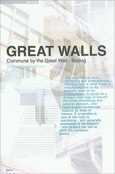 Which
brings up another aspect of Commune, perhaps too early to resolve: to what extent
it will function as fulltime, bedroom suburb for commuters to Beijing, or as
weekend 'retreat' from there or elsewhere. Many of the houses seem rather large
and closely spaced to be used only as holiday villas. Yet their idiosyncrasies
evoke a special-ness more suited to short visits of festivities than regular
day-to-day habitation. And a couple of them so radically challenge residential
conventions that living in them fulltime might be impractical. These are houses
, but necessarily homes.
Which
brings up another aspect of Commune, perhaps too early to resolve: to what extent
it will function as fulltime, bedroom suburb for commuters to Beijing, or as
weekend 'retreat' from there or elsewhere. Many of the houses seem rather large
and closely spaced to be used only as holiday villas. Yet their idiosyncrasies
evoke a special-ness more suited to short visits of festivities than regular
day-to-day habitation. And a couple of them so radically challenge residential
conventions that living in them fulltime might be impractical. These are houses
, but necessarily homes.
It is intriguing to see what architects choose to emphasise when let loose on
precedents. Many created unusual spaces for activities like sleeping or bathing,
and most included generous - even celebratory - areas for dining. Kitchen areas
run gamut, from vast open exhibition areas for food preparation, to compact,
tucked-away corners organised to get the job done efficiently. And what appears
in many of the houses - in totally different manifestations - are unique space
devoted to the un-ordinary. Whether in the symmetrical, zen-like tea-room of
Kengo Kuma's Bamboo House, the sunroom with contemplation slab of Kanika R'Kul's
house, or the vast loggia of Antonio Ochoa's house, It is as if, absent the
normal limitations to budget and client imagination,The authors invested specific
areas with their poetic interpretations of what might be missing from our lives
and homes. They are the non-essential dollops that so often get left out of
architecture and are so often missed.
As for the more normal areas of the houses, there is much to be admired, and
some to be disappointed by. Many bedrooms are prosaic to say the least, whereas
bathrooms seem to have more often excited the designers. Storage space is rare
and in most cases inadequate for such large buildings and the presumably ample
'stuff' their owners own, But to complain about such secondary matters in relation
to signature buildings seems petty. Their eventual owners will not choose these
buildings for their practicality. The planimetric organisations range from the
super-simple (Gary Chang's barbell parti, Rocco Yim's open overlap of living
areas, Chien Hsueh-Yi's house's strict axiality) to the near contorted, with
mixed success in both directions. R'Kul's house, for example, seems to deliberately
obscure its own plan, but the result is an almost dreamlike flow of spaces that
entice one to move through them by hints, framed views, snippets of later rewards.
A glimpse of a space that seems removed and unreachable, seen through another
intermediate one, invents a desire to explore and travel the building, somewhat
like a vernacular village. The building avoids segregated rooms; they share
their edges with adjacent ones, but the effect is calming not chaotic. A lovely
inner courtyard is formed irregularly by levels, staircases, walls and terraces.
While other outdoor spaces below reverse this and look dramatically outward.
Upstairs a series of minimalised sleeping areas (alcoves with futon platforms)
create a miniature community clustered around a fantastic central 'washing piazza',
a sun-filled place where family members might spontaneously congregate to share
luxurious ablutions. Sleeping is poetically reduced and bathing elevated to
celebrated ritual."
Moments like these are infrequent, but thrilling. In Ochoa-Picardo's offering,
a vast, horizontal loggia is thrust out over the valley, cantilevered from the
main 'box' of the house like some impossible outcrooping .The emphatic horizons
of roof and floor slice against the curvaceous surrounding landscape with romantic
audacity; standing in the spare and epic space makes one almost giddy. Is it
the architect's fault that the rest of his building, replete with sensuous rooms
and tantalising routes, pales slightly - despite its earth-red colour - by comparison?
In the crowd-pleasing Bamboo House, the centre is carved out and filled with
water, so that a tiny tea pavilion can be floated. Surrounded by vertical bamboo
and glass walls, hovering over still water, replete contemplation or superb
conversation seems virtually obligatory. The room renders the rest of the house
- and its mistakes - irrelevant. All of that is merely an excuse for this. How
many mortal residences sport even a single diving room?
The dining mezzanine of Nobuaki Furuya's house sits like a forest temple mount
in the centre of a luminous double-height volume. With three sides cut away
around it, behind thickened half-walls, the sense of occupying some elevated
perch is distinct. The tall, transparent external walls looking out through
mature trees encourage this feeling, and an audaciously large dining table is
the room's climax. A meal here could echo ancient imperial feasts, perhaps of
some Kmer royal, or Minoan high priest. That is if the undersized kitchen adjacent
could actually feed the kind of crowd the table can. Again, other parts of the
house may perplex, but this one room paints a picture of a way of living far
from ordinary.
Of course too many of these kinds of moments and the already dense formalism
of the houses would be difficult to digest .As it is, ideas sometimes go overboard.
Architecture that tries too hard suffers for it, and it is usually younger,
less experienced architects who want to include more genius in each building
than is good for it. Private houses, even large ones, have to be particularly
careful not to overdo. But architectural exhibitions are hardly ideal venues
for understatement. The 'showpiece' aspect of them encourages showmanship. And
Commune by the Great Wall is most definitely an exhibition. Redstone has created
a collection of high-design objects that happen to be buildings. Whether or
not they sell them, replicate them, or blow them up, that is what this is, indeed.
The company's publicity literature invited people to "Collect the Art of
Architecture". Plans for Commune by the Great Wall have evolved. The initial
11houses plus clubhouse are now to be opened to the public as a boutique hotel
managed by the Redstone company itself. The justification for this is to allow
more than just 11 owners to experience the architectural result, and this is
one way to do it. From the beginning, the developer has insisted that this is
not to be an empty, symbolic experiment, but a place for real people to use
real buildings. (Well alright, real rich people.) After all, Redstone is a business
enterprise, not a cultural institution. Phase Two will replicate a selection
from the original dozen, and sell them. There remain feasibility questions on
such mundane matters as transportation access, support services, costs ad profits
and so on. Among more serious issues is whether the aspect of Commune that is
most interesting - its unique architecture - can, when reproduced and sold to
different individuals - become self-parody. What would a street of Bamboo Houses
look like, a year or two down the road, when occupants might decide to paint
their own different colours, or hang laundry from the convenient poles? What
if someone decides later on to glaze in Ochoa-Piccardo's sublime loggia of roof
over Rocco Yim's courtyard? If the original dozen are prototypes, what lessons
are being learned from them that will be applied to their later clones? And
also, can distinguished signature buildings ever truly be appropriate for a
general audience, or will Beijing commuters in the end prefer to live in generic,
banal boxes decorated with mass-produced ornament and sleep-inducing layouts?
There have actually been indirect precedents for Commune. Seaside, in the United
States, comes to mind. An enlightened, nonconformist developer with money to
play with decided to break the mould of standard developments, inviting interesting
architects to contribute buildings Seaside's goal was different though: to create
a new kind of town and community based on an old kind of precedent. And the
method was quite opposite to Commune: very strict building codes were written
and enforced. Inventiveness came not from an absence of restrictions, but from
an abundance of them. Seaside proved an enormous success, both architecturally
and economically. If any company can duplicate that success on the other side
of the world, in an opposite economic system, foreign culture, different century,
and contrasting landscape, it is probably Redstone.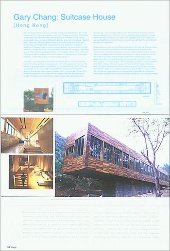 Gary
Chang: Suitcase House
Gary
Chang: Suitcase House
[Hong Kong]
Gary Chang's built entry is at once one of the simplest and most difficult of
the houses. In basic parti, the linear box building is crystal clear. The plan
is a 'dumbell' organisation: a large central hall with two smaller rooms at
each end. To enter the house with no preconceptions can come as something of
a surprise, as a world of emptiness - made of wood - takes over. Chang's principal
concept is that rooms as we know them, and furniture also, are not applicable.
Instead, the floor itself opens up in a series of trapdoors on hydraulic hinges
to reveal functional elements, like bed chambers, kitchen, bathrooms, virtually
everything. Close the hatches and make it all disappear. Open them up and create
a kind of secondary half-level - at navel height. Indeed, this is a large part
of the interest with the building: the contrast between the ultra-specificity
of the sunken chambers, and the ideal of clear, non-specific space above it.
The notion of a building which stores away not only the detritus of everyday
life, but many of its routine activities, is a seductive one. And in the operative
functioning of the hatches, it is actually achieved with little fuss. On a practical
level of course, the house is impossible; no-one could really be expected to
live like this. It would become annoying to go to such efforts merely to hang
up a shirt, or have a pee. Certain of the sunken compartments, such as the coffin-ish
sleeping pods, feel downright eerie to occupy. The privacy and closure Chang
is exploring was quite ingeniously solved centuries ago with something called
a 'door'. But none of these obvious criticisms devalue his exploration at Commune.
There is something alluring about his concept, and it is carefully realised,
even if it suffers from repetition. (One or two hatches are special, delightful
occasions, but repeated over and over and they threaten to become annoying and
systematic).
Despite being one of the most handsome buildings at Commune, the 'Suitcase'
house may turn out to be the most difficult to market, exactly because it demands
this unfamiliar level of involvement from its occupants. Chang is perfectly
right to question whether architecture offers more when it demands more, and
of course he is not the first to ask it: exponents of demonstrative functionalism
created some of early Modernism's seminal houses. If the idea that a house is
a 'machine for living in' never quite caught on in a broad context, it still
inspired plenty of creative juice for generations of architects. Chang's 'Suitcase'
house is not machine-like in finishes, character or layout (the plan is neo-classical),
but his invitation to us to be conscious of even the most mundane rituals of
our domestic lives is his unique contribution to Commune. In this, ironically,
the house may prove to be among the most popular as a temporary habitat within
the hotel. Living in it could be trying, but staying in it would be fascinating.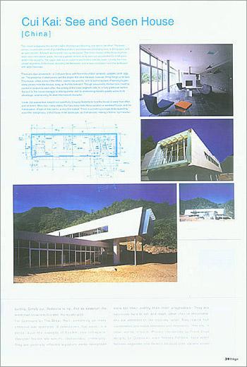 Cui
Kai: See and Seen House
Cui
Kai: See and Seen House
[China]
This house juxtaposes two slender slabs almost perpendicularly, one above the
other. The lower portion, fronted with a wall of gridded fenestration, encompasses
a lounging area, a dining area, and an open kitchen. A hearth anchors the room
at the centre. This lower section of the house burrows down one metre below
grade, forming a garden terrace on its own roof, punctuated by small glass lantern-like
skylights. The upper slab sits on columns and hovers over the lower. It holds
the more private segments of the house, including the bedrooms; one at each
end watch over the landscape with large balconies.
There are clear allusions to Le Corbusier here, with horizontal ribbon windows,
updated 'pilotti' legs etc. The presence of steel panels and the angles that
slice the ends however, bring things up to date. This house, unlike some of
the others, seems site-specific, and its author speaks of wanting to gain some
privacy from the houses rising up the hills behind it. Though presumably the
two bars could be pivoted in relation to each other, the sinking of the lower
segment calls for a fairly particular section. But as it is, the house manages
a striking profile, and its shimmering metallic palette works to its advantage,
underscoring its clean mechanical character.
Inside, the spaces lean toward non-specificity, bringing flexibility to how
the house is used, how often, and by whom. More than many others, Cui Kai's
entry feels like a vacation or weekend house, and his manipulation of light
on the interior is very fine indeed. There is something unexpectedly appealing
about the 'foreignness' of this house in the landscape, as if temporality making
it festive light-hearted.
Rocco Yim: Distorted Courtyard House
[Hong Kong] This
house is one of the smallest at Commune, even while its public zone feels spacious
and open, thanks to floor to ceiling glazing and double-height section. The
basic organisation is extremely clear, private bedrooms below in a 'solid' segment,
and an airy upper section for the public areas. The master suite is also housed
above, in an area overlooking much of the house, but with privacy available
through screen walls. The courtyard of its title is indeed pivoted off the orthogonal,
allowing the box of the house to sit object-like upon one of its edges. The
courtyard itself is simple; a stucco-walled space of modest proportions, either
devoted to functional necessities (drying the clothes, practising a hobby? or
contemplative ones. Conceivably, in a site of grandeur and panoramas, not to
mention an absence of privatising hedges or walls, residents might occasionally
seek recluse and introspection. This courtyard (only mildly distorted) provides
it.
This
house is one of the smallest at Commune, even while its public zone feels spacious
and open, thanks to floor to ceiling glazing and double-height section. The
basic organisation is extremely clear, private bedrooms below in a 'solid' segment,
and an airy upper section for the public areas. The master suite is also housed
above, in an area overlooking much of the house, but with privacy available
through screen walls. The courtyard of its title is indeed pivoted off the orthogonal,
allowing the box of the house to sit object-like upon one of its edges. The
courtyard itself is simple; a stucco-walled space of modest proportions, either
devoted to functional necessities (drying the clothes, practising a hobby? or
contemplative ones. Conceivably, in a site of grandeur and panoramas, not to
mention an absence of privatising hedges or walls, residents might occasionally
seek recluse and introspection. This courtyard (only mildly distorted) provides
it.
The two contrasting parts of the house address the site clearly. Inward/outward,
closed/open, opaque/transparent. The materials give support to the dichotomous
strategy, whit the lower section in white stucco, and the box above in steel
and glass. The glazed walls are mullioned with a filigree of metal that lighten
the building and create a lattice between inside and out. At night, screens
or curtains would need to protect from the nearby roadway, but during the day,
the house reflects sky and hills in a returned picture of its place.
As with some of the other houses, this one offers inhabitants a choice of opposite
qualities of space. The demarcation between them is sudden rather than gradual,
as if requiring that one's mood (or activity) be distinctly suited to one or
the other exclusively at any given time. Some might find the lack of an 'in-between'
zone or type of space a drawback, or missed opportunity. Others might argue
that this more blatant contrast heightens the drama of the building. Certainly
for such a small house, its dramatic effects are not lacking. While Yim laments,
like some of the other Commune architects, the difficulties of realising design
intent and quality, he cites as one of the most positive aspects of Commune,
"the absence of design censorship. All of us (were) free to create and
experiment this is rare in china almost unheard of in Hong Kong." Or many
places, for that matter.
Chien Hsueh-Yi: Grey is the Colour of the Wall
[Taiwan]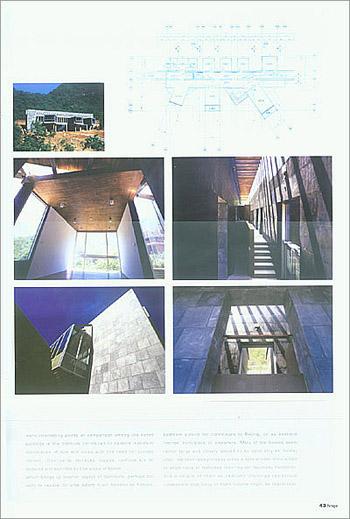 This
house is immediately appealing (even before entry) for the stark clarity of
its diagram. It is formed of a thick, habitable, stone wall, with pavilions
literally hung off it, oriented in three different directions toward views.
The stone wall is actually a double corridor; the one in front acting as the
circulation spine of the building and connecting the three main public rooms.
In the rear section of the building, less distinct pavilions clamp onto the
wall orthogonally, and also have a secondary hallway. Back here are bedrooms,
kitchen, bathrooms, service areas. The wall, both monumental and functional,
separates and joins the public and private halves of the house. It is interesting
to note how many of Commune's architects demarcated a sharp distinction between
public and private in their houses. Domestic architecture has always encompassed
both of course, of necessity, but they are rarely as sharply separated as with
Chien's great wall.
This
house is immediately appealing (even before entry) for the stark clarity of
its diagram. It is formed of a thick, habitable, stone wall, with pavilions
literally hung off it, oriented in three different directions toward views.
The stone wall is actually a double corridor; the one in front acting as the
circulation spine of the building and connecting the three main public rooms.
In the rear section of the building, less distinct pavilions clamp onto the
wall orthogonally, and also have a secondary hallway. Back here are bedrooms,
kitchen, bathrooms, service areas. The wall, both monumental and functional,
separates and joins the public and private halves of the house. It is interesting
to note how many of Commune's architects demarcated a sharp distinction between
public and private in their houses. Domestic architecture has always encompassed
both of course, of necessity, but they are rarely as sharply separated as with
Chien's great wall.
The finishes and tones of the building are impressive and sober. The building
feels 'masculine', with concrete, timber, metal and stone each used in ways
that bring out their textural qualities. The dark greys of the interiors bring
a kind of sternness to the spaces, but also an elegance. The three pavilion
rooms are minimal, well-proportioned 'boxes' in which to compose settings for
domesticity: 'Lounging', 'Dining', 'Activities'. This overall formality doesn't
make the house cold or unwelcoming, however, perhaps thanks to the materials.
It is not a casual building, but neither is it inhuman. The separation the wall
makes between hillside and valleyside is also interesting, in that it sets up
crisp and differing relationships to the landscape, depending on which side
one is on. Penetrating the wall from back to front feels like flight, liberated
suddenly from the compression between house and green hillside, while going
the other way seems like burrowing in, entering an enclosed realm, grounded
and safe. These experiences are made by the building's exaggerated simplicity,
which no doubt some will find unsubtle. But Chien's house builds a simple idea
with sophisticated means. That has always been a promising architectural strategy.
Antonio Ochoa-Piccardo: Cantilever House
[China]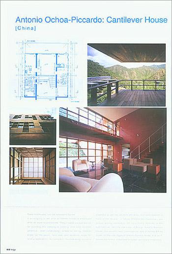 Ochoa-Piccardo
is the closest thing Redstone has to a resident architect. He has worked on
diverse projects for Pan Shiyi and Zhang Xin, and so this house may be his reward.
Or theirs, for it is one of the most compelling buildings at Commune. Occupying
a strategic site at the pivot bend on the valley, the house is highly visible
and offers the best views to its occupants. It is a giant earth-red box, striated
with a pattern of gridded openings and panels, and sliced horizontally by its
monumental loggia-terrace. The building pretends all sorts of rationality with
respect to the site; its section absorbs the hill into a grand entrance staircase
that then continues up through a sloped interior courtyard almost amphitheatrical.
Yes, the plan is wonderfully logical, as it centres the main hall between frontal
vista and rear embedded courtyard, and then circulates secondary rooms around
the latter on either side. No, none of this is what makes the house special.
It's the brash audacity of scale, colour, and primary elements that do. It manages
to be at the same time hard-edged and sensuous, stem and extremely romantic.
Its climax comes early (the heart-stopping loggia), rendering what in other
houses would be high-points on their own-the spiralling promenade, the culminating
roof terrace with the dollop of a single tree, the upper solarium - all as deferential
encores.
Ochoa-Piccardo
is the closest thing Redstone has to a resident architect. He has worked on
diverse projects for Pan Shiyi and Zhang Xin, and so this house may be his reward.
Or theirs, for it is one of the most compelling buildings at Commune. Occupying
a strategic site at the pivot bend on the valley, the house is highly visible
and offers the best views to its occupants. It is a giant earth-red box, striated
with a pattern of gridded openings and panels, and sliced horizontally by its
monumental loggia-terrace. The building pretends all sorts of rationality with
respect to the site; its section absorbs the hill into a grand entrance staircase
that then continues up through a sloped interior courtyard almost amphitheatrical.
Yes, the plan is wonderfully logical, as it centres the main hall between frontal
vista and rear embedded courtyard, and then circulates secondary rooms around
the latter on either side. No, none of this is what makes the house special.
It's the brash audacity of scale, colour, and primary elements that do. It manages
to be at the same time hard-edged and sensuous, stem and extremely romantic.
Its climax comes early (the heart-stopping loggia), rendering what in other
houses would be high-points on their own-the spiralling promenade, the culminating
roof terrace with the dollop of a single tree, the upper solarium - all as deferential
encores.
There are few missteps here (the entry-stair stone strips seem off kilter with
the wood and stucco) and much to delight. It proves that boldness needn't equal
coldness. The building seems ready for James Bond; dangerous and sexy simultaneously.
Location scouts are sure to make it famous. Ochoa-Piccardo contends that "designing
a house is much more complicated than designing a museum or an office building "
because it shelters man's dreams, love, happiness and pains always remaining
in our subconscious." Judging by his Commune house, these words ring very
true indeed.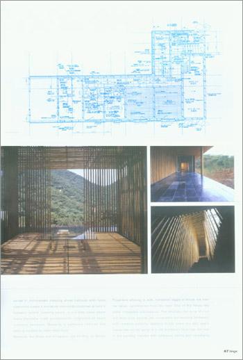 Kengo
Kuma: Bamboo Wall
Kengo
Kuma: Bamboo Wall
[Japan]
Kuma's house, already the most famous at Commune, is not really what it seems
to be. What it seems to be is a cage-like pavilion made of bamboo. But in reality
the bamboo is used decoratively, as a cladding material. The house itself is
far more conventional, which is perhaps wise, given Beijing's frequently hostile
climate. Basically, it is C-shaped structure organised around a central void,
which holds a shallow pool and in the centre, a tea room surrounded in bamboo.
This small room will make or break (or sell) the house as a whole, since the
public half to its left is fairly nondescript, and the private half to its right
is downright confused. The bedroom wing is a warren of smallish cells. The living,
dining and kitchen space, open and overlapping, is more successful, and features
some high points (a monumental kitchen counter-table) and some errors (a gratuitous
glass wall exhibiting a section of foam insulation). The tea room is the raison
d'etre of the whole exercise, and it is wonderful. The consistent cladding of
the house in vertical bamboo poles manages to give the spaces a softened light
quality, and the exterior a kind of cricket-cage interest, but it still feels
applied onto a fairly unexceptional structure. Given the decision to make a
house of bamboo, more could have been extracted from the spatial and tactile
nature of the material.
The house is sure to be a crowd pleaser, though. The simplest ideas, clearly
presented, always are. How much actual use one could make of a floating bamboo
tea room is uncertain, but this pavilion is visible from almost everywhere,
and brings an automatic calm to the other spaces of the house.
Kanika R'kul: The White
[Thailand]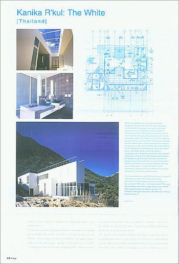 R'Kul's
crisp white stucco building spreads itself indulgently across its site like
a true villa, dramatically contrasting with the blue sky, dark ground and rough
greenery around it. Her building creates a series of interior spaces, all organised
loosely around an intimate enclosed courtyard, and flanked on the external edges
by terraces sharing a common plinth. The roof also becomes the final outdoor
space, reached via an exterior staircase climbing up from the courtyard. Thus
her building offers a number of places to contemplate the countryside around.
Inside, the building carries on with the theme of overlapping space. A generous
white hall holds living and dining areas, off the end of which begins an architectural
promenade through the rest of the house. A petite and spectacular sunroom begins
this, occupied merely with a minimal slab bench down its centre. Drenched with
light, surrounded in glass, it is a place aching for poetic daydreaming. Upstairs
lies that remarkable washing hall-surely one of Commune's greatest spaces.
R'Kul's
crisp white stucco building spreads itself indulgently across its site like
a true villa, dramatically contrasting with the blue sky, dark ground and rough
greenery around it. Her building creates a series of interior spaces, all organised
loosely around an intimate enclosed courtyard, and flanked on the external edges
by terraces sharing a common plinth. The roof also becomes the final outdoor
space, reached via an exterior staircase climbing up from the courtyard. Thus
her building offers a number of places to contemplate the countryside around.
Inside, the building carries on with the theme of overlapping space. A generous
white hall holds living and dining areas, off the end of which begins an architectural
promenade through the rest of the house. A petite and spectacular sunroom begins
this, occupied merely with a minimal slab bench down its centre. Drenched with
light, surrounded in glass, it is a place aching for poetic daydreaming. Upstairs
lies that remarkable washing hall-surely one of Commune's greatest spaces.
The house defines sensuality. Do we perceive an aspect of 'femininity' to it,
where Ochoa-Piccardos's seems masculine? Or is this because we know its author
is, in fact, a woman? Who cares she's built a jewel. R'Kul says that "architects
should never forget that our job is to fulfill other people's dreams as much
as our own. "At Commune, she's gone about this a bit differently: making
a house to dream in.
 KAY
NGEE TAN: Windows to the Wall
KAY
NGEE TAN: Windows to the Wall[Singapore]
This house is divided into two L-shaped pieces, one larger and one smaller, organised around a loosely-defined courtyard space. The smaller pavilion houses cooking, dinging, and servants quarters, while the larger one holds everything else. This unconventional separation of functions (one might expect bedrooms to be pulled apart, or guest quarters) is intended to enliven the outdoor area created between the two structures, which the architect describes as "the most unexposed and intimate part of the house." Timber decks wrap the buildings and reach toward the landscape in a kind of extended garden. And while the courtyard recalls traditional precedents, this one is open to the landscape through 'breaks' in its perimeter, affording visual connections beyond the house, constant reminders of where one is.
The larger pavilion is dominated by the main living area, a double-height space flooded with south-facing light, and looking out over the valley. On the same level is the line of guestrooms. While a staircase leads to a private library mezzanine and master suite.
By angling the buildings 45 degrees to each other, Tan plays with a double reading of a unified house broken apart, or separate houses coming together. This ambiguity potentially adds interest and depth to the pivotal courtyard, a theme echoed in Rocco Yim's Distorted Courtyard house.
 FURUYA
NOBUAKI : House in the Forest
FURUYA
NOBUAKI : House in the Forest
[Japan]
This large, L-shaped house sits near the top of Commune's valley. It is the
penultimate building site of Phase One, and nestles into a kind of crook in
the hillside, amid a stand of mature trees. The architect takes advantage of
this by raising the public arm of the L about two metres off grade, and glazing
the walls to complete a treehouse feeling on the interior. This bar of the building
is ended with a stark, open terrace (sans railing) that allows residents to
literally perch at branch level as they overlook the vista spreading out below.
It is a wonderful final touch to the house, which otherwise is unremarkable
except for the previously-cited spectacular dining plinth. The living room area
adjacent to this is decidedly undersized, barely fitting a couple of diminutive
two-seaters; one wonders where the crowd from the glorious dining room overlooking
it would possibly lounge before or after their meal. The perpendicular bedroom
wing is (dis)organised along a kind of adhoc route that seems undeveloped and
overly contorted.
On the building's exterior facades, Furuya does something quite unusual by sheathing
the vertically-striated brick walls in a second layer or glazing. This creates
an interstitial space between inner structural wall and outer glass skin. Presumably,
this achieves some thermal advantage, though the brick wall is at least 50%
open. It does give the exterior some interest, and is not unhandsome as a whole,
but whether this is worth the maintenance headaches it will bring (pockets of
glass appear impossible to reach for cleaning) is a question. This house claims
one of Commune's most secluded corners, and despite its size and hard materials,
feels very comfortable in its setting amid the trees. And at the inevitable
weekend parties of Commune, on other dining room will rival this one.
 Shigeru
Ban: Furniture House
Shigeru
Ban: Furniture House
[Japan]
This square building, one of the most modest in size, sits adjacent to Chang's,
and ironically, lacks precisely what the other has too much of. Where one is
a couple grades too clever for it's own architectural good, the other longs
for more complexity. The plan is clear enough: U-shaped arrangement of rooms
organised around a symmetrical courtyard open to the sky, entered along a central
axis. The principal living area is opposite the entrance, opening both onto
the courtyard, and out to the hills.
The walls of the house are finished in surfaces of simple bamboo cane matting,
a vernacular material that appealed to the architect precisely for is unpretentious
ubiquity. Familiar with lightweight surface materials from the architecture
of his native Japan, Shigeru Ban was intrigued with the bamboo plywood's aesthetic
possibilities, and its constructional rigidity. The material, after some testing
for strength in Japan, became the surface material for most of the house. Inside,
he compensated for expected poor constructional quality in wood, with China's
known expertise in making wood furniture. Thus the house uses system of prefabricated
and insulated furniture.
The architect says that the low, square building recreates the Chinese vernacular
architecture of courtyard houses. Yet the setting amid the rolling foothills
under the Great Wall might have inspired a less introverted organisation. The
ceiling of the main hall, which bows gently over a picture window-wall, does
go some way to acknowledging the context. On the other three exterior facades,
the house is emphatically prosaic, emphasising its architect's interest in non-exceptional
materials and forms. Maybe it's the relative 'loudness' of some of the other
Commune offerings that makes this entry seem so quiet. He says it was "an
honourable experience to be a part of exploring the great potential of China."
 YUNG
HO CHANG: SPLIT HOUSE
YUNG
HO CHANG: SPLIT HOUSE
[China]
Yung got the prize of having the last-and highest-spot in Commune to build his
house, and in a small but poetic touch, he recognised it by allowing the perceptually
infinite hills beyond into the whole settlement, right through his building,
in the form of a small creek that 'splits' it into two twin pieces. It is as
if a primordial spring feeding the valley is collected through this gateway,
and 'civilised' into its various uses in the 12 sophisticated buildings below.
It's a nice idea, and from the exterior lends this building a degree of organisational
and visual interest. A glass-floored entrance foyer spans the creek and links
the two halves, thus becoming a doubly-loaded moment in the plan. The two parts
splay apart to 'invite in' a view of the mountain and frame one of the valley.
But while this split seems tailor-made for the creek, and the head of this valley,
Yung actually invented it to create a flexible parti for a house that could
be adapted to other sites, on other hills, even without creeks. The 'hinge'
foyer that links the two halves can be pivoted on other sites to create variations
such as a 'right-angle' house, a 'bar' house, a 'back-to-back' house, or simply
one like this one, but with a new angle to it. In most of these variants, internal
parts, functional layouts, even services, would hardly require adjustment, let
alone redesign. It is a very clever proposition for a development such as Commune,
where architectural uniqueness must meet replication. Yung's series of 'Split
Houses' can each look unique, but share basic parts, materials, and strategy.
It is a solution none of the other architects came up with, and could easily
make Yung's the success of Phase Two.
 SEUNG
H-SANG: THE CLUBHOUSE
SEUNG
H-SANG: THE CLUBHOUSE[Korea]
This building is of course not a house, and quite a bit larger than anything else at Commune. It will hold the various communal facilities necessary to Commune as both a residential community and boutique hotel, including essential food shopping, recreational facilities (pool, tennis), two dining establishments (Western and Chinese), and staff quarters. The building is split into five pieces or slabs to break down its scale and to encompass remnants from a natural site its author felt worth preserving, including some original vegetation incorporated into the lobby. The latter appears prominently on the exterior facades, lending a dramatic note of earthy colour (which will evolve as time ages it) and cutting-edge hardness. It was a wiser choice than, say, stainless steel, in that its matte texture eases itself into a natural setting without obsequiousness. It can be brash and sensuous simultaneously.
The Chinese restaurant features 10 private dining rooms, each with an adjacent private garden individually themed. The rooms can be unified into a much larger space, leaving the ten gardens as a smaller-scale fringe decorating the collective hall.
Entrusted with by far the largest building of the dozen that form Commune Phase One, Seung clearly felt an added responsibility to set his entry down lightly on the site, and respect not only views to landscapes, but the immediate natural evidence of them.
A Chat with Zhang Xin,Co-CEO of Redstone lndustrie
h: Do you consider yourself more a 'developer' or more a 'patron of architecture'?
ZX: There seems to be a bad connotation that developer equals commercialisation,
which equals bad architecture. That is an old-fashioned interpretation of 'developer'.
For me, commercialisation is beautiful; commercialisation is a way for talents
to have a dialogue with society. Imagine a great artist who only works and lives
inside his studio and never goes out, never talks to an art dealer, to a museum
curator, to a collector nobody knows him. I am sure his talent is largely wasted,
and he feels very lonely.
A good businessman has to have the ability to discover value, and to commercialise
on that value. In our case, discovering value means discovering talent, architectural
talent, design talent, and then telling the world how great they are, how wonderful
their architecture is, and how much that should be appreciated by everyone in
the society.
h: Is there a natural conflict between these two roles? In other words, can
cultural products like 'high architecture' actually make money too?
ZX: We just want to demonstrate to the world how one can merge 'high architecture'
and commercialisation together, and how one can make money through discovering
and promoting great talents.
h: How were the 12architects chosen? ZX:
Most of these architects are quite active in the world; one sees their work
in all kinds of exhibitions. I also consulted Yung-ho Chang, Professor of Architecture
at Beijing University. We limited (the list) to only Asians to symbolise the
rise of Asian development.
ZX:
Most of these architects are quite active in the world; one sees their work
in all kinds of exhibitions. I also consulted Yung-ho Chang, Professor of Architecture
at Beijing University. We limited (the list) to only Asians to symbolise the
rise of Asian development.
h: Are you satisfied with the completed houses?
ZX: I am never satisfied with anything, that's just my nature, and it serves
as a strong motivation to carry on with my work, and with my life. Many of these
houses turned out to be different than I imagined, but there again, life always
turns out that way. The emphasis here is on "experimental" spirit
and "variety" to serve the purpose of a contemporary museum of private
houses. We are particularly interested in the architects' search for Asian character.
So many of the Asian cities were built in a very short period with no time to
think about their own identity and their own character in history. Historical
architecture seems to record more of their historical character than contemporary
(architecture); (buildings) were built based on the technology then, the lifestyle,
the material available and then the aesthetic standard, of course. Globalisation
has made it more difficult to maintain one's own distinct character, but one
should think about it. That's why the attempt by Yung-ho Chang to use mud wall
(construction), a very traditional way to build in rural China, is very interesting there
is a strong effort in search of Chinese contemporary character. After all, the
vision of building the Commune is to make people think.
h: What lessons have you learnt from developing Commune?
ZX: The experience is so unique! Usually for a development we work with one
master architect, here at Commune we worked with 12 architects, a much more
complicated process. Also, when so much of the work is experimental it becomes
quite difficult. For example, Shigeru Ban came to me and said: "I am not
interested in design"; he is more interested in inventing new materials,
and more interested in changing the procedure of working. We took him to the
timber market the fist time he came, and there he picked a piece of wood board
from the floor and showed great interest. It turns out that was the bamboo board
which is usually used on the construction sites for concrete molding. He wanted
to visit the factory, and find out how it's made, and if he could change it
to natural bamboo colour. Then, with many testings, the factory managed to make
it the colour that he wanted, and most importantly the bamboo's strength was
up to his requirement. Shigeru took it to Japan and tested it, and proved that
the compressed bamboo stick is stronger than wood. This is how we made the first
bamboo structure house in the world.
Gary (Chang)'s Suitcase House was almost rejected the first round I came to
the decision of accepting it. I think, for me, the best part of developing Commune
is that, once again, I have been shown that the world is much wider than my
own imagination. The danger of a developer is to set the limits based on our
own imagination. Commune has shown me how an idea can be conceived by us, but
grows much beyond our wildest dreams.
Another difficult part of developing a project like Commune is cost control,
including timing control. Our approach is to leave all the freedom to the architects
for Phase One, and try to control the costs in Phase Two.
h: Do you think that you're setting a precedent for China's building industry,
or should this remain a unique thing?
ZX: I think, no doubt, our effort has given the building industry a bit of a
shock. And hopefully, this will make people think more; to get out of the usual
box of doing business. Eventually, how much influence it will have on China
it's hard to say. For one, we are so honoured by the Venice Biennale's invitation
to exhibit this September. This was not part of the plan, and when it happens,
and when so many top international media cover it, we realise that the full
life of Commune has just begun and will grow beautifully.