 Stahl’s Colour Forecast for Autumn and Winter 2009 – 2010 says that there is a taste for change. After several seasons of over-abundance, eccentricity and the triumph of artificial over the natural, there is a strong desire to return to a state of equilibrium. Is this a reflection of the current world economic climate? Has this resulted in a wish for fashion to take things steady rather than go overboard? Or is it simply a question of pausing for thought while we mix technical and traditional once more?
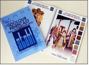
The booklet that has just been published shows six quite distinct colour groups all related to the significant keywords “personalization, mobility, quality, smart solutions and eco-supporter” which, in their turn, point the ways in which designers are thinking about the use of dramatic colours for the coming autumn and winter 2009 – 2010 seasons.
The forecast starts with the drama of autumn, a veritable explosion of autumn colours and shades on classic shapes in a group called “Assuring Heritage”. Here is luxury coupled with eccentricity and sophisticated couture, colours that combine young and modern with a touch of vintage.
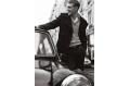
Just as winter is darker than autumn, so the next group, “Unexpected Poetry” moves into the mysterious realm of hypnotic dark colours, colours that are strongly reminiscent of the long dark evenings to come as winter progresses. Black magic and a dandy style combine with wonderful Victorian influences in a new fusion of feminine and masculine.
However, other aspects of winter, snow, ice and frost, lead into a panorama of conceptual neutral colours that are timeless and even seasonless in their sobriety. This is “Ambitious Sobriety”, a group of colours that allows form and function to cross the old European borders of East Berlin and Eastern Europe.
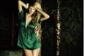
In complete contrast, the next group of colours, “Being the Fabulous”, leads straight into the splendid world of the ballroom. Perhaps a modern version of Vienna, these “sweeten up” colours bring a spectacle of luxury and glamour to a world of sugar frozen surfaces and theatrical colours.
From the ballroom to the rugged traditions of pioneers and cowboys, “Artisan Richness” means colours that provide toned-down charm as the natural energy of the trek to the west means traditional accents and nostalgic celebration as fashion dresses up for an evening of ho-down.
Finally, on the other side of the world, martial arts from aikido and samurai to ninja call for “Warrior Temper” colours that are striking and saturated. Here is the combat influence, the tribal approach and oriental authentic brought out in deep, extravagant colours.
Enriched with numerous fashion illustrations showing the derivations of these exciting colour palettes, the new booklet also contains a wealth of colour samples.