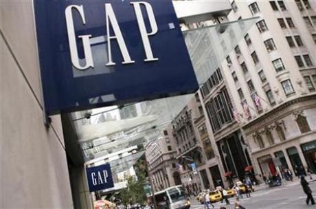
GAP Inc scrapped a new logo on Monday just a week after launching it following an "outpouring of comments" online and from customers in support of the original blue box design it's had for more than 20 years.
Gap rolled out an updated version of the logo last Monday on its website and planned to include it in its holiday marketing, a spokeswoman said.
But the company saw more than 2,000 comments on its Facebook page on the issue, with many people railing against the new logo and calling for a return to the old.
The original Gap logo shows a blue box with "GAP" written in white inside. The new logo on the website showed "Gap" in black against a light background, with a small blue box shown partially behind the letter 'p'.
"We've been listening to and watching all of the comments this past week. We heard them say over and over again they are passionate about our blue box logo, and they want it back," said Marka Hansen, president of Gap Brand North America. in a statement. "So we've made the decision to do just that -- we will bring it back across all channels."
Hansen said it was clear the company, founded in San Francisco in 1969, "did not go about this in the right way" and missed the "opportunity to engage with the online community."
"There may be a time to evolve our logo, but if and when that time comes, we'll handle it in a different way," Hansen said.
Related News
Photos
More>>


trade
market
finance
- Victoria Beckham's designer son
- Flower-like girls dazzle runway of Alma Aguilar show in Madrid
- Sisa Designs by Simone Rodrigues: from Brazil to Couture Fashion Week New York
- Andres Aquino Presents a Collection of Charm and Romance at Couture Fashion Week
- Elegant evening gowns grace Melbourne Spring Fashion Week