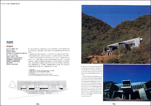
Airport
Designer: Chien Hsueh-Yi (Tai Wan)
Photographer: Satoshi Asakawa
Classification: boutique hotel
Location: Great Wall, Beijing
Size: 603m2
Structure: steel, concrete
Because of the special historical and environmental significance of the site, our first principle was to respect the history of the land, and design a structure that would blend in with the environment and return to nature.
The most striking aspect of the structure is the stone wall that is set in the sloping land of the site, forming a marked contrast with the ground's steep slope The wall is made with stones collected from the site, making it resemble somewhat the Great Wall of China, but also suggesting a spinal column of a living creature. The matrix space of the site changes along with the natural environment and individuals behavior, rationalizing the space of the structure to the land.
Text by Chien Hsueh- Yi
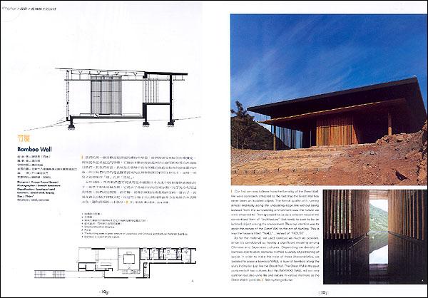
Bamboo wall
Designer: Kengo Kuma (Japan)
Photographer: Satoshi Asakawa
Classification: boutique hotel
Location: Great Wall, Beijing
Size: 716m2
Structure: steel, concrete
Our first aim was to learn from the formality of the Great Wall. We were constantly attracted to the fact that the Great Wall has never been an isolated object. The formal quality of it running almost endlessly along the undulating ridge line without being isolated from the surrounding environment was the nature we were attracted to. That appealed to us as a criticism toward the conventional form of "architecture" that tends to seek to be an isolated object among the environment. Thus our intention was to apply this nature of the Great Wall to the act of dwelling. This is way the house is titled "WALL", Instead of "HOUSE".
As for the material, we used bamboo as much as possible, since it's considered as having a significant meaning among Chinese and Japanese cultures. Depending on density of bamboo and its each diameter, it offers a variety of partitioning of space. In order to make the most the most of these characteristics, we decided to place a bamboo WALL, a layer of bamboo along the site's inclination just like the Great Wall in the past portioned off two cultures, but this BAMBOO WALL will not only partition but also unite life and culture in various manners as the Great Wall in particles.
Text by Kengo Kuma
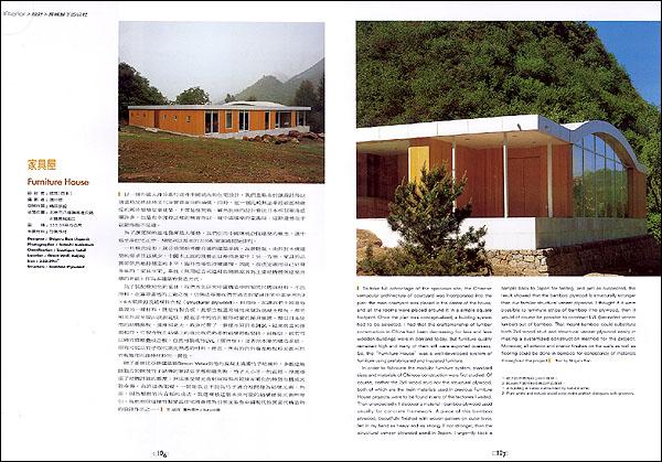
Furniture House
Designer: Shigeru Ban(Japan)
Photographer: Satoshi Asakawa
Classification: boutique hotel
Location: Great Wall, Beijing
Size: 333.39m2
Structure: Bamboo Plywood
To take of advantage of the spacious site, the Chinese vernacular architecture of courtyard was incorporated into the plan: the main courtyard was placed in the center of the house, and all the rooms were placed around it in a simple square footprint. Once the plan was conceptualized, a building system had to be selected. I had that the craftsmanship of lumber construction in China had been decreasing for less and less wooden buildings were in demand today. But furniture quality remained high and many of them still were exported overseas. So, the "Furniture House" was a well-developed system of furniture using prefabricated and insulated furniture.
In order to fabricate the modular furniture system, standard sizes and materials of Chinese construction were first studied. Of course, neither the 2x4 wood stud nor the structural plywood, both of which are the main materials used in previous Furniture House projects, were to be found in any of the factories I visited. Then unexpectedly, I discover a material-bamboo plywood used usually for concrete framework. A piece of this bamboo plywood, beautifully finished with woven pattern on outer layer, felt in my hand as heavy and as strong, if not stronger, than the structural veneer plywood used in Japan. I urgently took a sample back to Japan for testing, and just as suspected, the result showed that the bamboo plywood is structurally stronger than our familiar structural veneer plywood. I thought if it were possible to laminate strips of bamboo into plywood, then it would of course be possible to construct LVL(laminated veneer lumber) out of bamboo. That meant bamboo could substitute both2x4 wood stud and structural veneer plywood easily in making a systemized construction method for the project. Moreover, all exterior and interior finishes on the walls as well as flooring could be done in bamboo for consistency of materials throughout the project.
Text by Shigeru Ban
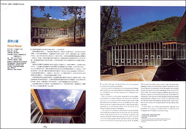
Forest House
Designer: Nobuaki Furuya(Japan)
Photographer: Satoshi Asakawa
Classification: boutique hotel
Location: Great Wall, Beijing
Size: 572.5m2
Structure: steel, concrete
I consider the major role of architecture is to have people encounter with something/someone.
An pointed task for architecture is to make people stand where they would have never visited without the building and face with an unforeseen scene, unknown topography or landscape, be it urban or natural.
Also, architecture can be a vista for people to come together, to encounter one another and come together, to encounter one another and come into contact with the spirits of others in the anonymous field of urban city and nature. It can thus become an accumulation of memory of al people who meet there on their own purpose or by accident. It also gives people a possibility to remind of one's values met in the certain place through a spatial memory of the building.
The project for a residence in the beautiful forest by the Great Wall creates the opportunity for the encounter with the unknown others, at the same time with the very particular topography and views to the Great Wall in the distance. In its interior, scooped out of the woods, people will feel like held by forest even when you are in the house. It is here that one can sense, as Alberto Giacommetti described, being a ball of light within the vast expanse of forest. In another word, people reaches here led by the architecture, commune with nature of seasons wirh precious friends, and some can sense something of the sentiment of Giacometti. The project employs ordinary local materials however, it will form an extraordinary space by novel method of construction. From the rooms with repeated vertical slits, people will acquire each different scene by their occupied space, and the view of nature will change by moving around in the room After all, the visitors will not passively but actively choose their own place.
To enjoy their own spatial experience like "editing" is a beginning of continuous stroll between architecture and topography, and forest.
Text by Nobuaki Furuya
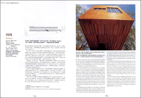
Suitcase
Designer: Gary Cheung (HK)
Photographer: Satoshi Asakawa
Classification: boutique hotel
Location: Great Wall, Beijing
Size: 346.88m2
Structure: steel, concrete
Suitcase (stiff, flat-sided case for carrying ones personal items, etc., when one is traveling)House (a building esp. one constructed as a home for family)-unfolding the mechanics of domestic (p) leisure.
Casting a question mark upon the proverbial image of the house, this scheme attempts to rethink the Distorted Courtyard House nature of intimacy, privacy, spontaneity and flexibility, It is a simple demonstration of the desire for ultimate adaptability, in pursuit of a proscenium for infinite scenarios, a plane of sensual (p) leisure.
The dwelling represents a stacking of strata. The bottom stratum acts as a container for domestic fittings and equipment, services and maids' quarters. It also fulfills the requirement for storage. Compartments are concealed by a landscape of floor panels, which when raised, give access to the world below. The top stratum houses a series of blinds that may be raised or lowered to subdivide the space. Similarly, the building envelope is a stratification of vertical layers. The outer skin is a wrap of full height double-glazed folding doors while the inner layer is comprised of a series of screens forming a matrix of openings. The abstract fa?ade pattern is thereby rooted in its user-oriented operational logic. Together, these strata give form to the zone in between.
The middle stratum embodies a reincarnated piano mobile par excellence for habitation, activity and flow. Adapting a nonhierarchical layout with the help of mobile elements provided by the envelope, it transforms itself readily according to the nature of the activities, number of inhabitants, and personal preferences for degrees of enclosure and privacy. At any point in time, only the essential elements required will have a spatial presence. A metamorphic volume, it slides effortlessly from an open space to a sequence of rooms, depending on the inhabitants' specific requirements.
The house is located at the head of the Nangou Valley in Shui Guan. The site, which slopes steeply towards the north, is relatively exposed. To maximize views to the prominent Great Wall and solar exposure in the continental temperate climate, a north-south orientation is adopted. It will be possible to see the great wall from all major spaces within the dwelling whilst seated. One of the essential components of luxury is choice and the dwelling is provided with multiple entrances, all with equal status, whilst each room is differentiated by the provision of unique amenities.
The floor panels evoke unmistakable associations with the interior of a luxury cruise-boat. They are pneumatically assisted for ease and convenience. When opened a sensual, soft and inviting interior is revealed. As mid-level compartments fulfill most requirements little furniture is required. What furniture there is, is mobile and plays an active role in the dwelling's high degree of adaptability.
Text by Gary Cheung
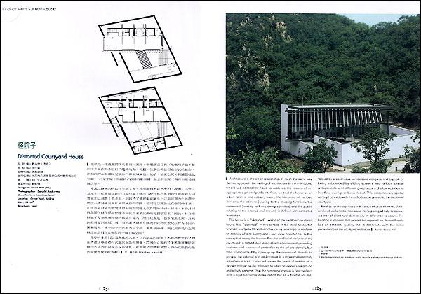
Distorted Courtyard House
Designer: Rocco Yim (HK)
Photographer: Satoshi Asakawa
Classification: boutique hotel
Location: Great Wall, Beijing
Size: 481m2
Structure: steel
Architecture is the art of relationship. In much the same way that we approach the making of architecture in the metropolis, where we constantly have to address the issues of an appropriated private/ public interface, we treat the house as un urban form in microcosm, where the hierarchy of various domains: the intimate (relating to the sleeping function), the communal (relating to living/dining activities) and the public (relating to the external environment) is defined with controlled interaction.
This house is a "distorted" version of the traditional courtyard house. It is "distorted" in two senses. In the literal sense, the footprint is adjusted from the orthodox square shape to conform to specify of site topography and view orientation. In the conceptual sense, the house offers the traditional attribute of the courtyard: a tamed and internalized environment providing coziness and a sense of protection to the private domain, but then transcends it by opening up the communal domain to engage the external wild environment in a more contemporary adventurous spirit. It also addresses the practical realities of a modern holiday house; the need to adapt to various user groups and activity patterns. Thus the communal domain is designed not with a rigid functional demarcation but as a flexible volume, flanked by a continuous service zone alongside and capable of being subdivided by sliding screens into various spatial arrangements to fit different group sizes and allow activities to interflow, overlap or be secluded. This contemporary spatial concept co-exists with the orthodox one geared to the traditional courtyard.
Finishes for the kept basic with no superfluous elements. White rendered walls, timber floors and stone paving all help to convey a sense of silent rural domesticity in difference to nature. The bamboo sunscreen that protect the exposed southwest fa?ade has an ethereal quality that c contrasts with the solid permanence of the courtyard enclosure.
Text by Rocco Yim
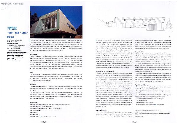
"See" and "Seen"
Designer: Cui Kai (Mainland China)
Photographer: Satoshi Asakawa
Classification: boutique hotel
Location: Great Wall, Beijing
Size: 410m2
Structure: steel, concrete
To go to the mountain is for sightseeing. The No. 3 site facing the north and the northeast has a broad view with ranges. The near view is No. 1 Villa, the community club and the distance view rolling mountains. Therefore, the living room and the dining room are designed to face north and the bedrooms are designed to face northeast and be fully open.
Blocking the landscape should be avoided in the first place when building houses in mountains. The architect should bear in mind that No. 4, No 5 and No.6 Villas are at behind. Therefore, the living room and dining room can crouch in the bushes by sitting on the sunken terrace, the top of which is covered with earth and grass. The ridge thus becomes a glass one. The bedrooms are designed in parallel with the mountain mass, so the vision of the valley is kept unobstructed and the mountainous ground continues by propping up the structure of the house. Who Comes for the Weekend?
People other than masters and maid who will come for a visit are uncertain either in terms of the number, their relationship or sex. So the living room connects with the dinning room, the outdoor spaces link with the indoors' and thus a gathering lot is created. Except the master bedroom, other rooms can be divided and arranged freely to form rooms in different sizes. There are two toilets which, when necessary, can be used for men and women respectively. The master bedroom is raised above the terrace, so to have exclusive access to both cleat vision and privacy. Thus design enables the toilet open to the outside view and people can enjoy the landscape when taking a bath. When masters are out, maid should stay under the porch and need not enter the room unless for cleaning. The kitchen is open, and more like a bar counter. When there are many visiting friends, the delicacies prepared in the council chambers will be offered through a special exit without disturbing the visitors. In addition, there are a driver's room, a laundry, a facility room and a garage in the Villa.
Lighting Chamber
In the dark night, a lantern will light up you way back home. It is the glass lobby that welcomes you home. The living room and bedrooms share a two-floor high lighting chamber. Inside the chamber, with the change of the time in a day, the sunshine, the lamp light, grilles, and shadow of the trees paint pictures on the walls. Outside the chamber, with the change of seasons, the grass, green vines, yellow leaves and ice crystal varies the scene, expressing the harmonious dialogue between man and nature.
Easy to Build
Since the Phase I is small in scale, and located in the mountain valley far away from the city, it is uneconomic to use commercial concrete for field casting. Steel structure (living room and bedrooms) and a small portion of brick and concrete structure (subsidiary houses and walls) are adopted here.
The living room sinks some one meter below the ground level and the earth dug up needs not to be taken away for it can be used for leveling the courtyard and covering the roof. If big rock is encountered, with slight sculpturing, it can be used as furniture or furnishings in the living room.
Heat preservation and energy saving should be considered for the exterior construction, such as: earth covering, insulated floor slab and roofing, three-layer hollow glass windows and doors and especially the treatment of cold bridge at the junctions between outdoor and indoor of the steel structure.
Repetition and Diversity
This concept is also applicable for other sites, with the basic condition being a terrain with height difference.
The angle between bedrooms and the living room can be adjusted.
The glass of the glass lantern can be altered (transparent glass, frosted glass, with printing or tinted glass).
The compartments of bedrooms can be changed.
The area is variable.
Interior materials can be changed.
Text by Cui Kai
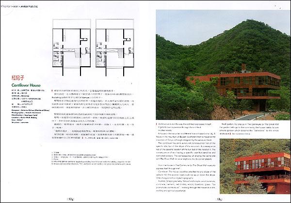
Cantilever House
Designer: Antonio Ochoa (Mainland China)
Photographer: Satoshi Asakawa
Classification: boutique hotel
Location: Great Wall, Beijing
Size: 485m2
Structure: concrete
Architecture is not the way the architect expresses himself.
It gets its own expression through the architect.
In other words:
A house in the mountain is different from a house in the city. A house in the mountain of Badalin is different from a house in the mountain of Sanya, although designed by the same architect.
The cantilever house is a natural consequence not of the specific site, but of the slope of the mountain. A consequence not of the specific location of the sun but of the need of it. The consequence of not having a specific user but sensitive and cultivated people. The consequence of sharing the same site with The Great Wall not as a neighbour, but to contemplate it.
How the house in The Commune by The Great Wall wants to express itself through me?
Cantilever: The house could be attached to any slope of the valley's hill. The access road could be up or down the slope of the valley's hill. The access road could be up or down the slope. Little changes to the original topography.
Austere: Simple geometry. Natural and simple use of materials, concrete, cement, red bricks, wood, bamboo, glass. "La promenade architectural": walking through the house is a rich exciting and spiritual experience.
Roof garden: As long as in The Commune by The Great Wall the garden belongs to the community, the house needs its own private garden which became the "belvedere" to the whole landscape.
Text by Antonio Ochoa
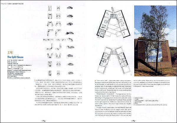
The Split House
Designer: Yung Ho Chang (Mainland China)
Photographer: Satoshi Asakawa
Classification: boutique hotel
Location: Great Wall, Beijing
Size: 449.136m2
Structure: wood frame, compressed earth
The house is "split", right in the middle, to bring the scenery, the space, therefore the Shan Shui (mountain and water) in. As far as the water, a creek literally runs through the glass-floored entrance room. A courtyard, or outdoor living area, is enclosed by the mountains on one side and the house, with its two split halves, on the other. The line between the natural landscape and manmade architecture is thus blurred.
The split house is "convertible": The angle between the two halves can be adjusted to fit the house onto various hill sites. According to the geographical condition of a particular locale, the split house can be transformed into singular house, parallel house, right angle house, bar house, or back-to-back house. In other words, split is only one of many states of a flexible architecture.
The split house is ecological: Its load bearing walls are made of ram earth with partian wood frame. Ram earth construction is a time honored building method in China. With minimum environmental impact, it builds a well-insulated wall that would make the house cool in the summer and warm in the in the winter. Meanwhile, the incorporation of such tradition suggests an effort to create a contemporary Chinese house without mimicking the images of architecture of the past.
Text by Yung Ho Chang
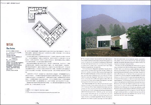
The Twins
Designer: Tan Kay Ngee (Singapore)
Engineer: Battle McCarthy, UK
Photographer: Satoshi Asakawa
Classification: boutique hotel
Location: Great Wall, Beijing
Size: 477m2
Structure: brick, concrete
The ambiguity between nature and the man-made found in many traditional painted renderings of Chinese landscapes forms a point of departure for the design of the House on Plot 9 given its awe-inspiring location in the foothills of the Shuiguan mountains and company with that well-know man-made construct of superlatives-the Great Wall.
The House has been designed to seamlessly integrate with its natural context. A stone local to the area has been used as one of its main material components. The massing of the house in the form of a larger building and a smaller annexe both L-shaped in plan and their careful positioning within the valley-site has also helped to create this integration. The annexe which houses the kitchen and dining areas nestles itself against a steep cliff to the north side of the other living areas reside.
Both these buildings and north cliff-side enclose a quiet courtyard of sorts forming what would be the most unexposed and intimate part of the house. Stepped timber decks crawl like creepers from this courtyard, all the way round the perimeter of the buildings and into the "extended garden" which is the entire valley and more as well as places for rest and contemplation. Unlike traditional courtyard types which are largely closed to the exterior apart from the sky, the house is perforated on all sides by special openings of various types so that even whilst inside, one is constantly visually connected to the outside. This is one illustration of how; rather than protect itself from its context, the house works with and borrows from its natural surroundings to make up its fabric.
The entry into the main building lies at the end of a gently rising, stone-lined path with the annexe resting to the left on just slightly higher ground. Large double-leaf doors lead to a spacious double-height lounge area with large vitrine windows, sun-drenched, and south-facing views of the valley. Towards one side of the living room is the hint of the more protected and inward looking courtyard lined with a corridor leading to all guest bedrooms on the same level. A suspended staircase leads up to a mezzanine library space, an open-air terrace deck and the master bedroom. The annexe lays a stone's throw away from the quiet of the courtyard via a second stone-lined path and forms the social hub of the house. Meals would be served in its dining space which is cosier, much more intimate and which has wonderful views all the way down the valley, as well as an outside terrace for open-air entertaining o a pleasant summer's evening.
It is the architect's hope that houseguests at the Plot 9 house are given ample opportunity to connect in their own way with the raw physicality of its site and indeed the centuries- old history associated with it.
Text by Tan Kay Ngee
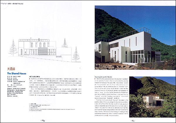
The Shared House
Designer: Kanika R'kul (Singapore)
Photographer: Satoshi Asakawa
Classification: boutique hotel
Location: Great Wall, Beijing
Size: 523.58m2
Structure: concrete
Exposing the spirit of the site
I think that the weekend home in the mountain in addition to the weekday home in the city is intended to provide variation to the lives of the users. The "inwardness" as well as "non-physical" nature of our relationship to our surrounding in the city tends to leave us "shielded" from the nature as well as our physical-self. I see that the weekend home in the mountain serves not necessary to take us "away" from the city life (because city life itself can also be wonderful and stimulating in one way) but to "expose" us to the "missing components" that would give all of us a more "balanced" existence.
Therefore, the house should "expose" the users to the positive sides of the surrounding (the mountainous context, a view of the Great Wall, the clear sky full of stars, good air, various viewpoints) but at the same time has to be able to "shield" the users from the natural elements that might be too harsh for human being to take (the most fundamental idea of shelter). The idea is concentrating on creating strong relationship between the indoor / outdoor space (s) in terms of terraces and courts.
Text by Kanika R'kul
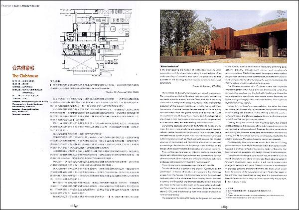
The clubhouse
Designer: Seung H-Sang (South Korea)
Photographer: Satoshi Asakawa
Classification: boutique hotel
Location: clubhouse
Size: 4109.31m2
Structure: concrete
 "Kultur landschaft"
By disengaging the notion of landscape from its strict association with land and interpreting it in a tradition of an understanding of urbanity may open the possibility to find qualities in the existing that lie beyond scientific limits and parameters.
Thedor W. Adorno (1903-1969)
The site has so beautiful landscape as natural environment. The mountains enclosing 3 valleys have dramatic topography and make splendor scenes, and the Great Wall that is boundary of this site is running on the steep mountains. I felt a moment that execution to this project might be an impolite human will. Even the remains of several peasant houses seemed to be as if they have defeated from the grand nature and destroyed. I was anxious how I should design here. I come back from first visit on site, thinking that firstly natural elements should be preserved such as rocks, trees, and even existing artificial structures.
Considering adequate volumes of the function to the site and its slope, the given mass should be articulated into several pieces in order to design the void and empty space prior to volume. That is the best way to communicate with nature between indoor and outdoor spaces as well as filled and void spaces. So divided volumes of the building will harmonize with other houses and surroundings. Architecture as landscape is the intention of the design, where accommodates diverse culture and various functions.
Thus, architecture here is not an object to see but a place where people with different background meet and communicate to each other and nature. Given nature and artificial architecture make new landscape with people. Let me call this "cullturescape".
This culturescape is new nature, new place and new life.
The site of the club is center of the project "Commune by the Great Wall" in terms of location and program. For the easy access from the houses, it is located near where the south and east valley start in the whole area. Form the site; view to the west is open to the Great Wall and the most beautiful one of the whole site. View to east is also open to the east valley and North and South view is closed to the mountains. Slope in the site is about 0-10%, and it is slanted up from west to east and south to north simultaneously.
The program of the club is the facility for the guests and residents of the houses, such as two kinds of restaurant, swimming pool, gallery, grocery, management center and employee's accommodations. This building would be a space where various people meet, diverse cultures communicate, and different functions exist. Compared to the other functions, the swimming pool is so big that the volume should be articulated into pieces.
The Chinese restaurant with 10 private rooms has 10 private enclosed gardens that have different themes and when this restaurant is used as one big hall with flexible partitions the separate gardens would make very special scene. Especially the lights through the gaps that distorted rooms' make give us mysterious hallway scenery.
Except the employee's accommodation, the other functions are connected systemically by the corridor and placed according to its existing site elevation. The swimming pool and western restaurant above the Chinese restaurant command scenery view to the Great Wall and get fantastic sunset.
Entering lobby the beautiful trees would be seen, that existed ones. Landscape is the extension of the club, having linear elements connecting the building and road. There are fountains, wood decks and parking lots, however some parts of the exterior are remained as they are. All the artificial elements are delicately attaches to the existing landscape. The edge should be treated very specially.
Consequently this architecture would look like as if 5 long pieces some out from North Mountain rather than built on earth. Material is another method of expressing design philosophy, that is consistency of materiality and design concept is indispensable.
Therefore this building is consisted of natural material such as wood, steel plate and stone in concrete. Steel plate is rusted in time and changed in color so that it will match natural color change by seasons and years. Stone in concrete is combination of exposed concrete and stone from the site itself, which would keep the context of the natural environment. Finally they seem to be as if they have been there for long time. It is derived from our beautiful memory that is very important reason why we are now.
Text by Seung H- Sang


