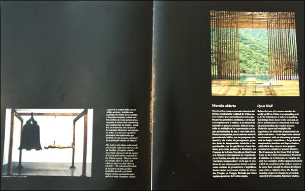
Before the eyes of a western tourist, the reality of life in China as appealing as it is for its inhabitants to take in everything that brings them closer to the west and, as far as architecture is concerned, to its way of understanding the creative process. Today the open wall multiplies the experiences in which the professionals on either end share in an impressive natural environment, with a elementary program and no budget restrictions - , large doses of imagination, intuition and improvisation, with which they carry to term projects gestated at a smaller or greater distance. The Commune By The Great Wall in Shui Guan or the China International Practical Exhibition of Architecture in Nanjing are only two examples of this rapprochement in which the exoticism of its authors seems to be more than enough to attract developers and visitors. Added to these the Tianjin housing project in Tanggu is presented, signed by five leading Japanese studios.
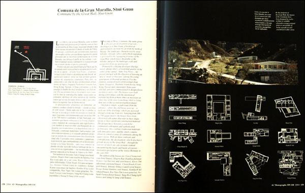
Commune by the Great Wall, Shui Guan
THE GREAT WALL Commune (the name given to this private development of upscale dwellings) is in Shui Guan, a location at approximately one hour by car from the north of Beijing. The landscape, characterized by steep hillsides, intricate valleys and a thick vegetation, is governed by the zigzagging presence of the Great wall, which traces the profile of the hillsides and gives the landscape scale and perspective from any given point.
Promoted by a Beijing developer that has raised. Among others, a residential quarter in the center of the capital soho New Town -, the project emerged with the objective of boosting an idea of Asian architecture among the young generations of Oriental architects. For this purpose, a total of twelve professionals from Japan, Singapore, Thailand, South Korea, Hong Kong, Taiwan and continental China were selected, and were commissioned to design eleven residences and a club. The house were built during a first phase, with the intention of reproducing them as many times as necessary in other sites of the area (something which is being done now in the second development phase).
The plan is simple: a path leads from the entrance where the club house goes up to each one of the dwellings, which are accessed through cul-de-sac branches. Ranging from 300 to 700 square meters, the houses have been christened with names that refer to their shape, layout or most significant construction material. The designs move between a search for communion with nature and sophisticated architecture; they combine traditional materials with innovative ones; and the whole complex strives to convey a sense of community among the upper classes. With all these contrasts and contradictions, the development, which also has a private access to the Great Wall through the interior of which one can circulate without encountering the hustle and bustle of tourists received a special prize at he Venice Biennale in the year 2002.
The authors of the houses are: Gary Chang (suitcase hotel house), Shigeru Ban (bamboo. furniture house) Cui Kai (see and seen house). Rocco Yim (distorted courtyard house), Chien Hsueh-Yi (air port house), Antonio Ochoa (cantilevered house), Kengo Kuma (bamboo wall house), Kanika R kul (shared house), Kay Ngee Tan (casas gemelas), Nobuaki Furuya (forest house), Yung Ho-Chang (split house) and Seung H-Sang (club house).
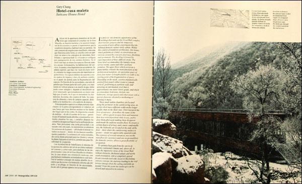
Gary Chang
Suitcase House Hotel
IN SPITE OF THE domestic appearance of the buildings that make up the Great Wall complex, their touristic purpose and the temporary succession of users allows experiments that the habitual domestic nature rarely admits. Within this context of manifesto-architecture, this house which performs as a hotel, is conceived as an exercise around the concepts of privacy, flexibility and spontaneity. The dwelling is formed by superimposition of three different strata. The lower level accommodates the laundry room, service rooms, sauna and other auxiliary premises. The upper floor, which serves as a piano nobile, contains the main functions of the architectural manifesto. An open-plan space of forty-four meters in length and five in width is the starting point of the fragmentation of space. Depending on the needs, a series pneumatically assisted floor panels either rotate or remain vertical, performing as partition walls and unveiling an intermediate level that is approximately one meter below grade, and which accommodates bedrooms, kitchen, two bathrooms, storage spaces and other areas with a special character, devoted to meditating or listening to music.
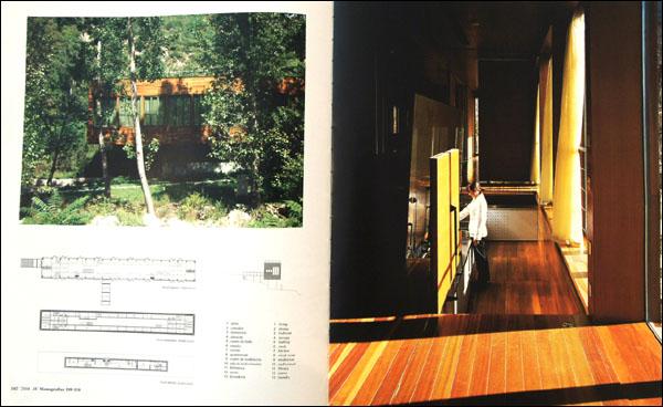
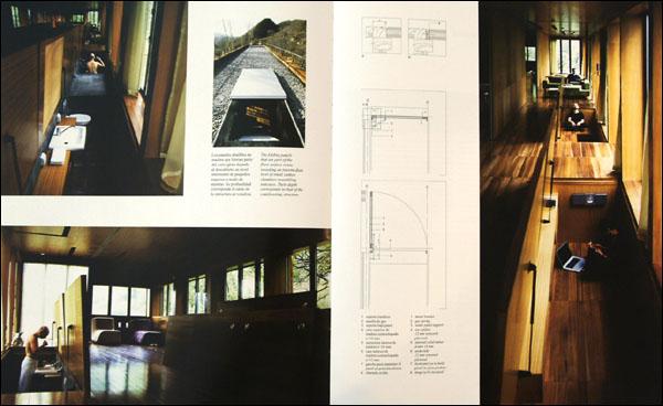
These small sunken chambers are located along the perimeter in the cantilevering area, on a strip which has a different width on the longer facades than on the short ones. Their layout in the form of suitcases from there the name of the house allows guests to open them and maintain them in a vertical position while in use, and to close them afterwards making them disappear underneath the uniform wooden floor. To ensure a certain degree of privacy and a more comfortable size, the bedrooms are located at the ends of the floor there where the cantilevering surface is greater- inside two appreciably squared voids. The existence of several entrances, two on the main floor for customers and one on ground floor for domestic service, allows a great flexibility of occupation.
To optimize heat gain from the sun in an extreme continental climate and, above all, to enjoy the impressive views of the Great Wall without obstacles, the house adopts and north-south orientation, with a completely glazed fa?ade to wards each side. Loyal to the folding suitcase concept, the stairway leading to the roof terrace emerges from the ceiling and folds as needed. From this point the landscape can be viewed and enjoyed in its entirety.
Shigeru Ban
Bamboo Furniture House
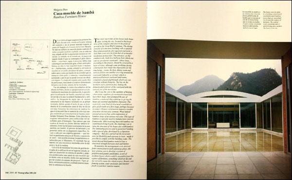
THE FIRST SKETCHES of this house took shape after visiting the site, located it the lower area of the complex and close to the point of arrival to the Great Wall Commune. The design consists of a one-story building with a squared floor plan around an also squared courtyard, a style that is not very far from that of vernacular residential architecture. The entrance, on the southern side, leads to a hallway from which one can see an exterior courtyard whose base, according to the project, should be covered by a layer of water, although some problems during construction have made this impossible for the time being ; rooms, kitchen, dining room and services follow one another is a ring around the courtyard, linked by a corridor which is interposed between courtyard and rooms, completely glazed and through which one can circulate without obstacles. The bay on the northern end is partition-free, linking the domesticated exterior of the courtyard with the natural one of the mountains.
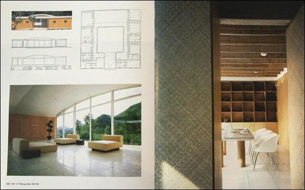
But it was the visit to the outskirts of Beijing, where many suppliers of construction materials have their shops, that prompted the use of bamboo, a material that ended up by giving the house an essential and definite character. The search for some kind of structural wood did not give good results at a first stage, perhaps because in today s Chinese construction industry wooden structures are not very common. What indeed seemed attractive has a thin lamination of bamboo strips of an intense red color. This type of bamboo is typically used to manufacture concrete frameworks. After realizing that with bamboo one could build strong boards, the challenge was to raise the structure of the house also with bamboo. The laminating process and its posterior bonding with a special glue, developed by a Japanese company that also carried out the necessary tests flexibility and exposure to heat- made it possible to comply with the building codes. The result showed that bamboo material has a structural strength between steel and timber.
To minimize the management costs derived from construction in such a faraway place, the best solution was to develop a system of prefabricated panels and frames, a sort of modular house which could be assembled just like a piece of furniture, something which in the end has served to name the whole project. Beams, unit framing system, outer enclosure and interior finish reveal their bamboo nature.
Cui Kai
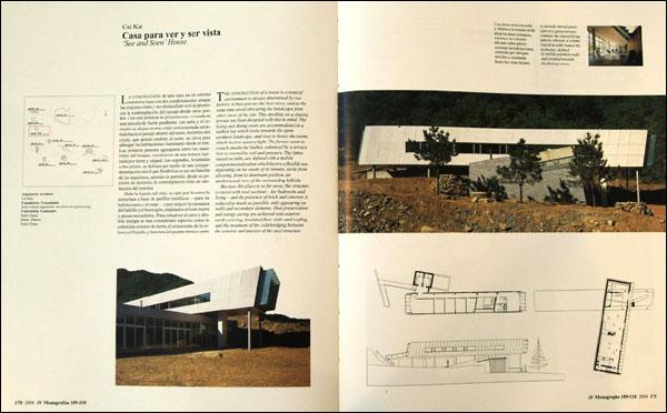
See and Seen House
THE CONSTRUCTION of a house in a natural environment is always determined by two factors: it must pursue the best views, and at the same time avoid obscuring the landscape from other areas of the site. This dwelling on a sloping terrain has been designed with this in mind. The living and dining room are accommodated in a sunken bay which looks towards the open northern landscape, and rises to house the rooms which receive eastern light. The former seem to crouch amidst the bushes, enhanced by a terrace that is covered by soil and greenery. The latter, raised on stilts, are defined with a mobile compartmentalization which favors a flexible use depending on the needs of its tenants, aside from allowing, from its dominant position, an unobstructed view of the surrounding hillside.
Because this place is so far away, the structure is raised with steel sections for bedrooms and living and the presence of brick and concrete is reduced as much as possible, only appearing on walls and secondary elements. Heat preservation and energy saving are achieved with exterior earth covering, insulated floor slabs and roofing, and the treatment of the cold bridging between the exterior and interior of the steel structure.
Rocco Yim
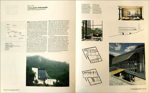
Distorted Courtyard House
TWO MECHANISMS of distortion turn this house into a deformed version of the conventional courtyard house: one , in the literal sense, affects the building s square footprint, whose angles and side length are altered in order to adapt to the topography of the site and views; the other one , in the conceptual sense, has to do with the layout of the rooms, because on ground floor the spaces open up to the tamed nature of the courtyard whereas on the upper floor they open to the faraway views via a large glazed gallery which seems to be oblivious to the nearby presence of the courtyard.
The need to adapt the dwelling to occupants who come in different numbers and from varied places determines the collective spaces three areas are delimited, private for sleeping, shared for living and dining, and public to interrelate with the exterior in such a way that the interior partitions are not fixed walls but sliding screens meant to mark a versatile space organized by a band of services. Rendered walls, timber floors and stone in the exterior paving harmonize the house with the rural character of the exterior. A bamboo screen protects the exposed south-west fa?ade from the afternoon sun.
Chien Hsueh-Yi
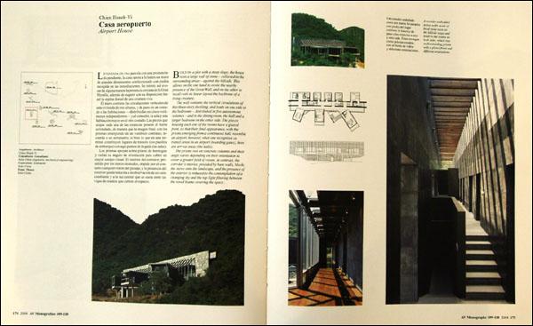
Airport House
BUILT ON a plot with a steep slope, the house rests a large wall of stone collected in the surrounding areas against the hillside. This allows on the one hand to evoke the nearby presence of the Great Wall, and on the other to recall with its linear layout the backbone of a living creature.
The wall contains the vertical circulations of this three-story dwelling, and one side to the bedrooms distributed in five autonomous volumes and to the dining room, the hall and a larger bedroom on the other side. The pieces housing each one of the rooms have a glazed front, so that their final appearance, with the prisms emerging from a continuous hall, resemble an airport, however, what one recognizes as transit areas in a airport (boarding gates), here are arrival areas (the halls).
The prisms rest on concrete columns and their angle varies depending on their orientation to cover a greater field of vision. In contrast, the corridor s interior, presided by bare walls, blocks the views onto the landscape, and the presence of the exterior is reduced to the contemplation of a changing sky and the top light filtering between the wood beams covering the space.
Antonio Ochoa
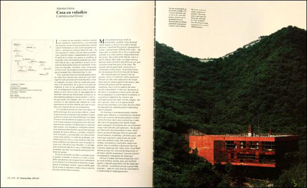
Cantilevered House
MOUNTAINSIDES always entail an architectural problem and a demand which requires a more or less radical design decision. Faced with his generic topographical avatar-present in any hillside of the valley-the house opts, as it name shows, for a cantilevered structure as a clean solution, independent from the terrain. The profile of the hillside, which is barely altered, takes shape as a huge stairway that runs below the house and allows access and circulation from both parts of the slope. The itinerary thereby generated, conceived as a promenade architecture of spiritual echoes, lets the mountain flow freely beneath the house.
This rational approach (generic but not specific ) allows to establish a subtle distinction between site (the valley adjacent to the Great Wall) and plot (that assigned to the house); and between the general and the particular conditions, which serve to address the other specific requirements. In this way, the layout of the house is a manifesto in favor of the sun, but not an adaptation to a determined orientation; it is an answer adapted to the sensitive and cultivated tourist who shall visit the complex, but not a specific client; it is an approach that pursues the panoramic views onto the Great Wall, but that does not establish a direct relationship with its presence.
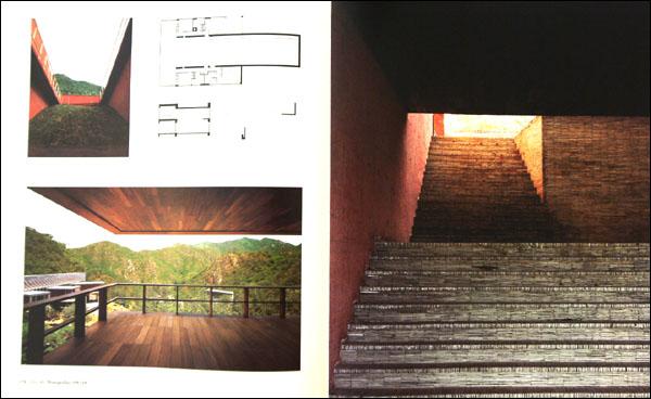
The dwelling is structured around a double-height space linked to a covered terrace and from which one accesses the private premises located on the first floor, that is also reached via a ramp. The void corresponding to the double-height space segregates the program into two residential wings with bedrooms and bathrooms. The facades are built with a flexible modular system, which allows an uneven interplay between open and closed windows, resembling a furniture and at the same time aesthetic order. The landscaped rooftop, envisioned as a belvedere and private garden, tries to establish a distinction between collective landscape (the valley of the Great Wall) and the private one, between the domesticity of the house and the mountaineer s pursuit of peace on stopping to contemplate the landscape.
he use of simple and natural materials such as wood, bamboo, mortar, glass and red brick ensures a smooth integration with the landscape. The concrete-essential to execute a projecting structure-takes its color from the environment, so moderating its rough appearance.
Kengo Kuma
Bamboo Wall House
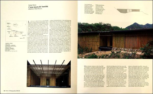
THE IMPOSING PRESENCE of the Great Wall prompts to search for architectural forms that may seamlessly blend with the landscape instead of being roughly inserted as autonomous and isolated objects. The thousand-year-old stone structure moves through the abrupt landscape appearing to have to beginning and no end accentuating the relief of the natural shapes and the changing color of the vegetation. This aspect, above all the rest, has inspired the design of this bamboo house, baptized bamboo wall , built precisely on the plot s most precipitous area.
Conceived as an in habitable wall, the house has a linear layout with rooms consecutive to one another, and connected by a corridor. An exterior stairway of stone pavers rests on the slope and goes all the way up to the access porch and the hall of the dwelling, from which one can see the central courtyard. The rooms are located on both sides of the courtyards, and their position depends on the degree of privacy needed by each one. The living, close to the entrance, is open to the landscape at one end of the piece and separated from the courtyard through the dining room ad kitchen. Across are four bedrooms and three bathrooms. A stairway along the courtyard s footprint descends to a lower floor where, thanks to the slope of the terrain, it has been possible to open another three bedrooms and ancillary storage rooms and systems. When seen from the outside, the existence f two levels reinforces the condition of wall that the house aims to achieve.
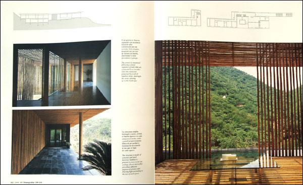
The construction has been carried out in bamboo to express the differences between this domestic wall and the Great Wall; whereas the latter is associated to values such as strength and division, the bamboo of the former symbolizes the cultural flow between China and Japan, allowing light and air to circulate between exterior and interior. The possibility of placing the bamboo strips closer or farther apart allows them to act more or less as a curtain, like the wall separating kitchen and dining room or the one wrapping the central area of the courtyard, or as partition wall, in the rest of the dwelling. Glass enhances the gradation of spaces and water has been incorporated it the interior covering the courtyard, so its center can only be reached via two concrete bridges. The bamboo on the facades gives them the same rough imprint as the abrupt, green hillsides leave on the landscape.
Kanika R kul
Shard House
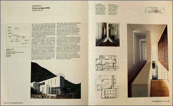
THE MORE AND more evident exterior influence and the stunning speed of the interior development have given rise in the Chinese society to a new work-oriented lifestyle. In an attempt tot improve the quality of life, the number of working hours increases and the individuals are more alone; that is, one has more money but less friends. To counteract this situation, the house by the Great Wall tries to favor rest and social relationships.
The program for this weekend house is altered to improve two aspects of daily life that are being neglected and which are considered essential: the contact with the exterior with nature and the relationship with others. This project endeavors to fulfill these needs with terraces, porches, courtyards and roof decks intermediate spaces which connect the individual with nature. And the shared spaces, halls, living rooms, corridors and balconies, are multiplied and oversized, fostering the encounter between the house s inhabitants. The peace and quiet of the entry courtyard extends to other spaces such as the living and dining room as well as to other breakout areas of the main terrace. Windows puncture the building at every angle and orientation.
Kay Ngee Tan
Twin House
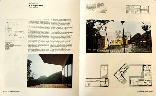
THE ORIGINAL scheme, drawing inspiration from the thick vegetation that characterizes the site of the project, attempts to extend the feeling brought by a walk in the woods and around the house and therefore a series of pedestrian paths have been built around it , and so transform the interior space into a clearing in the woods. The house itself is actually a promenade with a variety of small spaces in which one can stop to rest.
The L-shaped floor plan was designed to make possible a simple double-pitched roof. Its orientation can be modified, and in fact a second pavilion with the same footprint and looking towards the opposite direction goes up right in front of the house. The main volume, of two floors, contains a double-height living area on one side and rooms on the other, whereas the upper floor extends only over the living room, with a bedroom, leaving the other side open to fit out a terrace. The second volume accommodates dining room and kitchen in the shorter arm of the L, and bedrooms on the longer side.
Though at first local materials were going to be used wood and grey brick ,finally the house was built with concrete and steel.
Nobuaki Furuya
Forest House
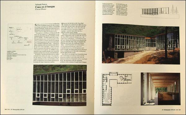
THOUGH THE HOUSES on the Great Wall Commune are scattered over different areas of the valley, the plot where this house goes up was in the middle of the woods. Being this the main differential fact, the project suggests creating a covered space that may be a reflection of the exterior foliage.
The project is distributed along the two arms of the L-shaped floor plan. To enjoy the views of the Great Wall at dusk, the dining room the largest space of the house is oriented towards the west, whereas the bedroom was placed at the opposite end of the other wing. To maintain the bedroom area warm, the traditional Chinese kang a brick bed built over a heat source was moved from the balcony, where it is originally placed, to a sort of Japanese-style porch. Actually, the house itself can be conceived of as a continuous porch that takes in the peace and the light from the woods.
Here there is an attempt to go beyond the local style in the deign of columns, beams and the proportion of space, and at the same time an interest in using local materials such as wood and brick. The interaction with the remaining architects of the commune brought many changes.
Yung Ho Chang
Split House
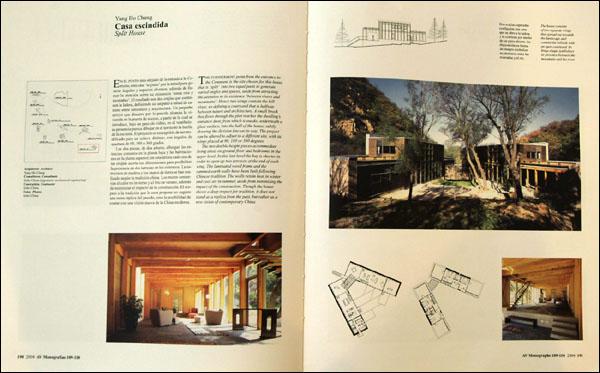
THE FURTHERMOST point from the entrance to the Commune is the site chosen for this house that is split into two equal parts to generate varied angles and spaces, aside from attracting the attention to its existence between rivers and mountains . Hence two wings contain the hill slope. So defining a courtyard that is halfway between nature and architecture. A small brook that flows through the plot the plot reaches the dwelling s entrance door, from which it sneaks, underneath a glass surface, into the hall of the house, subtly drawing the division line on its way. The project can be altered to adjust to a different site, with its wings placed at 90,180 or 360 degrees.
The two double-height pieces accommodate living areas on ground floor and bedrooms in the upper level. In this last level the bay is shorter in order to open up two terraces at the end of each wing. The laminate wood frame and the rammed-earth walls have been built following Chinese tradition. The walls retain heat in winter and cool air inn summer, aside from minimizing the impact of the construction. Though the house shows a deep respect for tradition, it does not stand as a replica from the past, but rather as a new vision of contemporary China.
Seung H-Sang
Club House
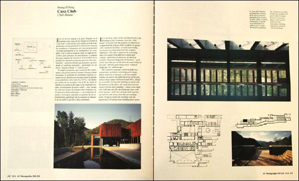
IN A CENTRAL AREA of the road that leads to the dwellings of the Commune rises this club house or social club, the purpose of which is to complement the houses of the residents or guests with communal facilities, as well as providing permanent accommodation for the complex employees. The club is meant to be a meeting place for people from different origins and cultures, and strives to preserve, as much as possible, the preexisting natural elements such as the trees that are visible from the main lobby of the club thereby generating a new cultural landscape or culturescape .
The extensive program, which includes two restaurants, an indoor swimming pool, shops, offices and even a museum, is fit into smaller volumes located in the different levels of the plot (whose slope ranges between 0 and 10%), linked by a corridor. To keep the building in touch with the memory of the place, the materials used are wood, Cor-ten steel cladding whose color shall vary with time just like the landscape does with every season and a mix of stone and concrete carried out with stones from the surrounding areas, trying to endow the building with the appearance of having been standing there years.
