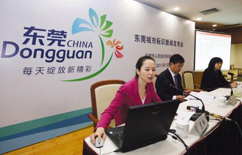
The Dongguan s City Logo Press Conference is held in the city's Conference Center on January 20, 2011.[Photo Source: Dongguan Daily]

Dongguan s city logo
Which logo can best display the image of Dongguan City? During the period between December 16 and December 24 last year, the Dongguan Information Office released the five proposals to the public to extensively solicit the opinion from all circles of society. It turned out that the first proposal with the slogan "Vibrance blossoms everyday" was the most popular with people.
According to the online voting statistics, the total number of votes for the five logo designs is 56,466. The first proposal gained 29,500 votes, counting for 52.24% of the total. The second design gained 9,745 votes while the third one gained 5,239 and the last two gained 6,285 and 5,697 respectively. After the careful discussion and research of city leaders at the joint conference, the first proposal with the slogan "Vibrance blossoms everyday" was eventually chosen as the Dongguan City s brand image logo.
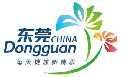
The logo uses green, blue, red and orange as the city's principal colors and chooses "vigor" as the core value of Dongguan City, which gets common recognition while soliciting the opinions of the general public. The blue color means internationalization while green means livability, orange offers warmth and tolerance, and red passion. Rich colors represent the vibrancies of Dongguan.
The core design element of the logo is Guanxiang (Aquilaria Sinensis) or China Eaglewood typical of Dongguan, from which Dongguan derived its name. The grouping manner of the blossom and the five petal mould well shows the characteristics of Guanxiang. The diversified development and infinite vigor of Dongguan is displayed via the logo in strong but grateful way.
(By Tan Jing)


